Once in a while you meet someone and you know from that first smile: this is something. There’s magic. There’s an extra spring in your step. You’re in it for the long haul. It’s a dream when this happens in the design world.
This pretty much sums up my first meeting with Wasatch Mountain Arts, the folks who put on the Wasatch Mountain Film Festival. When I met these guys last year, we discovered that we had already connected in multiple places online. The WMF is a new film festival here in Utah, with all the enthusiasm of youth and a healthy respect for their big brothers (like the Banff Mountain Film Festival and Telluride Mountainfilm). The WMF is run by Wasatch Mountain Arts, an organization whose goal is to promote arts and mountain culture in Utah—this was like the best Tinder match a bunch of mountain-loving creatives could hope for!
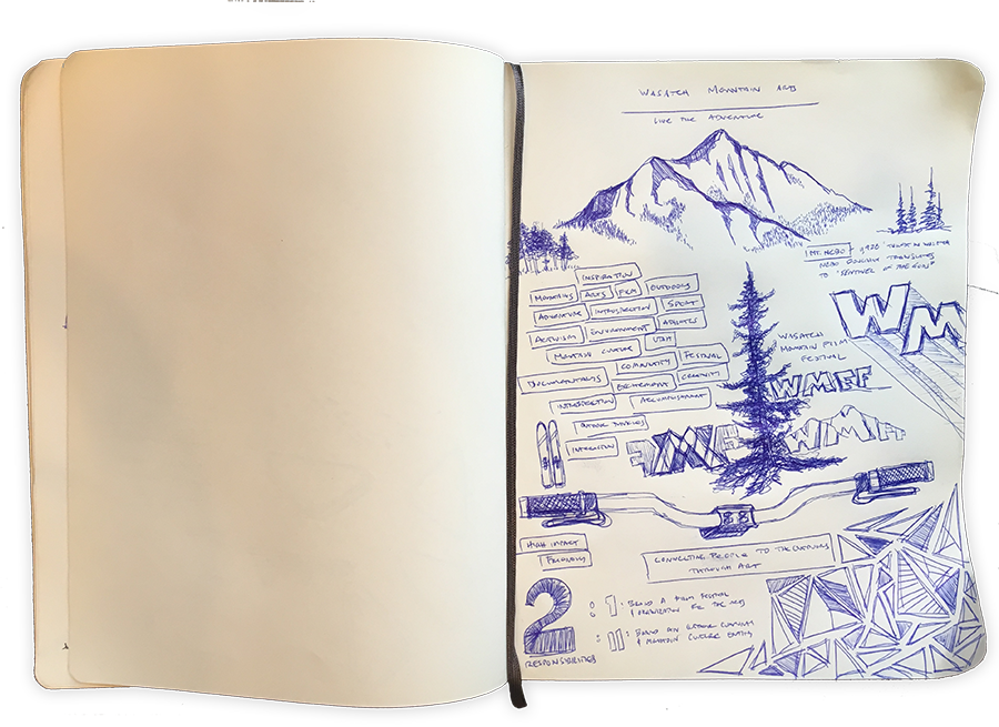
After an initial chat about WMA’s purpose and vision for the festival, I went to work on designing logo comps and identity ideation. Creating a new logo and visual language for a client that lives and breathes both the outdoor and art worlds, just like us, was a dream project. But it quickly turned into one of the more challenging branding projects I’ve taken on. There is a very fine line to walk when taking on a project like this: you want to have an immediately recognizable logo and you want the identity of your client to be understood at first glance, but you also want to steer clear of the trite and over-done. They needed a logo that looked “film festival” enough but that didn’t look just like every other film festival logo out there (some better than others)—to convey the film aspect without showing an actual film reel or strip. And then we needed to tie in the Wasatch Mountains, something that was also important to me personally because they are my favorite spot in the Lower 48. I had to do this logo justice.
Looking to the Wasatch for inspiration, I found Mt. Nebo to be particularly inspiring. With twin summits a little under 12,000 feet, it isn’t the tallest mountain in the state, which means there is always room for improvement and something bigger to strive for. It’s a non-technical walk up, which means any skill level can conceivably summit, but it’s also a big day in the mountains and you have to be committed to it. Mt. Nebo has that iconic Wasatch silhouette and is a peak that many people who drive north along I-15 are familiar with; for some of us it represents home, for others it means arrival at the doorstep of adventure.
As we worked through design revisions and honed in on the final Wasatch Mountain Film Festival logo and identity standards, we also ended up with a new logo for Wasatch Mountain Arts. With more of an art focus and modern design feel that could appeal to a wide audience, we built the WMA logo on the silhouette of Mt. Olympus: the most prominent peak from Salt Lake City and one that is approachable, close, and aesthetically pleasing.
From here we turned our attention to event design and print materials, with a major focus on the event magazine. In past years, the magazine was created in-house and quickly printed; but it became apparent that festival goers would throw away the magazine as soon as a film screening was over. With our collective outdoor focus, we decided that creating this book for digital consumption made much more sense. We would still print the magazine—but a smaller number and higher quality that people would actually want to keep—and then sell it at the event. With so many incredible creatives and filmmakers submitting work as this event grows (including the likes of Chris Burkard, Brody Leven, Sender Films‘ Peter Mortimer, and Fitz Cahall of the much-loved Dirtbag Diaries), we have access to some world-class imagery and stories that enable us to build a magazine that anyone in the outdoor community would be excited to get their hands on.

With the opportunity to create distinct assets like this high-quality magazine and award laurels for filmmakers and adventurers who excel at their craft, this project has pushed our creativity as a studio and allowed me personally to spend more time sketching and flexing that same creative muscle that used to get me in trouble as a kid (how many artists out there remember being scolded for drawing on homework?). I like to think this creative strength training has elevated the quality of all the other projects we have on deck at IDG right now too.
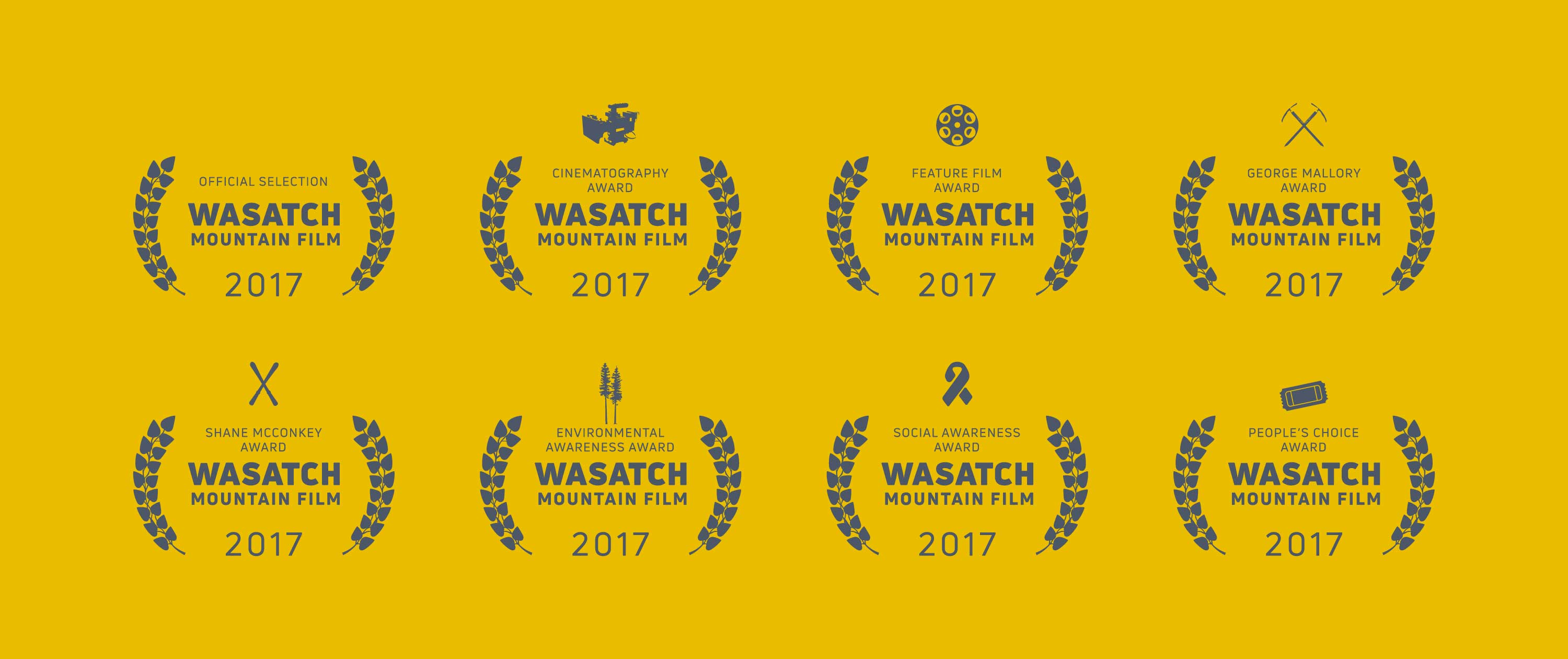
The Wasatch Mountain Film Festival is still pretty young. I’m so excited we’ve had the opportunity to partner with them in this early stage as a sponsor of the 2017 festival, and I’m looking forward to growing that partnership and role with the organization in the years to come.
Wasatch Mountain Film Festival screenings are taking place June 17th–21st in Park City, Salt Lake City, Sandy, and at Snowbird Resort. If you want to go and haven’t gotten tickets yet, you’re in luck—use the code ILOVETHEWASATCH to get your tickets 50% off! Hope to see you there!


