Rebranding IDG

This past October, with our noses to the grindstone, we passed over an incredible milestone for Incline Design Group (IDG)—we officially crossed the 5-year threshold. Though our business revolves around building marketing plans for our clients and creating content calendars that include important things like business anniversaries—things that tell the story of an organization and deepen its larger community relationships—we often find our own brand gets neglected in the process. It’s a classic example of, “Do as we say, not as we do.”
But it’s high time we took our own advice.
The core of what we do at IDG is branding and brand storytelling, and we felt this milestone was an appropriate time to rework our own brand identity. Creating a new identity is a serious project: it requires understanding the tone, the people, the mission, and the product, and processing those things into a cohesive visual representation. The discovery process for a project like this needs to be thorough and detailed, including information about the history of the organization and any stakeholders, while also keeping in mind the trajectory of the brand—where, and whom, you want to be in the future.
This is a process we never take lightly. When clients venture to take on a new brand identity or online presence, there is often a feeling of resistance—the stakes are high and it is of utmost importance to get it right. IDG’s rebranding process was no different; as much as we push other brands to stretch to their fullest potential, that same resistance and reluctance to risk putting forward anything less than perfect gave us our own share of sleepless nights.
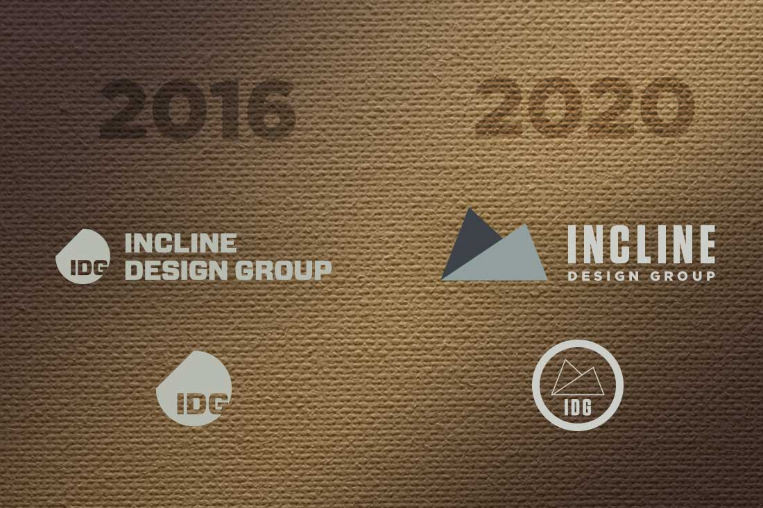
As a design and branding studio, our mark needs to be understated but professional and confident—a representation of who we are and how we work to communicate elegantly with our clients and their target audiences—with subtle colors and typography that is bold but not flashy. Over the last 5 years, our sketchbooks have filled up with countless ideas of what the updated logo mark should be, but it was in a flash—one of those times between late night and early morning—that the idea for this new identity system came about: it would be based on intersecting planes that moved like origami, rising and falling away from the viewer. It would be mechanical, but at the same time organic and call to mind the mountains we love to play in. It would be simple, but with every detail strongly considered.
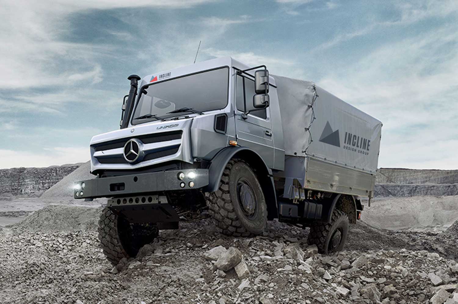
This logo mark is referential to our undying love for the mountains, where we are lucky enough to live, work, and play. At the same time, it is technical, mechanical, and adaptable for a variety of nuanced treatments; it is just as much a folded or 3-dimensional planar shape as it is a large structure on the horizon. It sits comfortably on hardware, in a lab environment, on a tee shirt, or emblazoned across a Unimog. There is inherent motion in it, but it is solid and stable, without yelling or being overly complicated. The color palette is adaptable—from subtle tones of a mechanical future, to the flat, analagous colors you see across Europe in doorways, on café sugar packets, or on commercial trucks navigating impossibly small village roads.
A logo can’t be all things to all people, but we think this mark comes pretty close to conveying our target market: small businesses here in the Intermountain West, technical and scientific organizations around the world, the outdoor and cycling brands we love, and of course, all the optimists in nonprofits and NGO’s trying to make the world a better place.